Overview
In early 2021, Venkat Srinivasan, the Head Archivist at the Archives at NCBS, approached me to create an identity for the them. Right from the start, the goal of the Archives has always been to not merely be a collector and keeper of artefacts but to draw meaning from various sources.
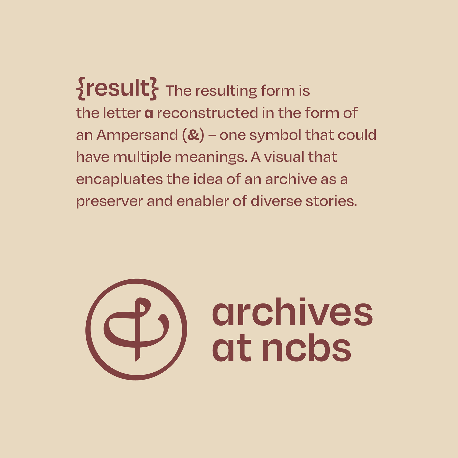
With this idea in mind, they had internally tinkered with a bunch of ideas. The one that had stuck was this idea by one of the PhD students at the Archives, Aditi Mishra, who kept seeing similarity in the form of Treble Clef and an '&' (ampersand), a form of duality that to them captured the purpose of the Archives.
Client
Sector
Research & Education
Areas
Identity Design
Branding
period
January – November 2021
release
November 2021
launch event
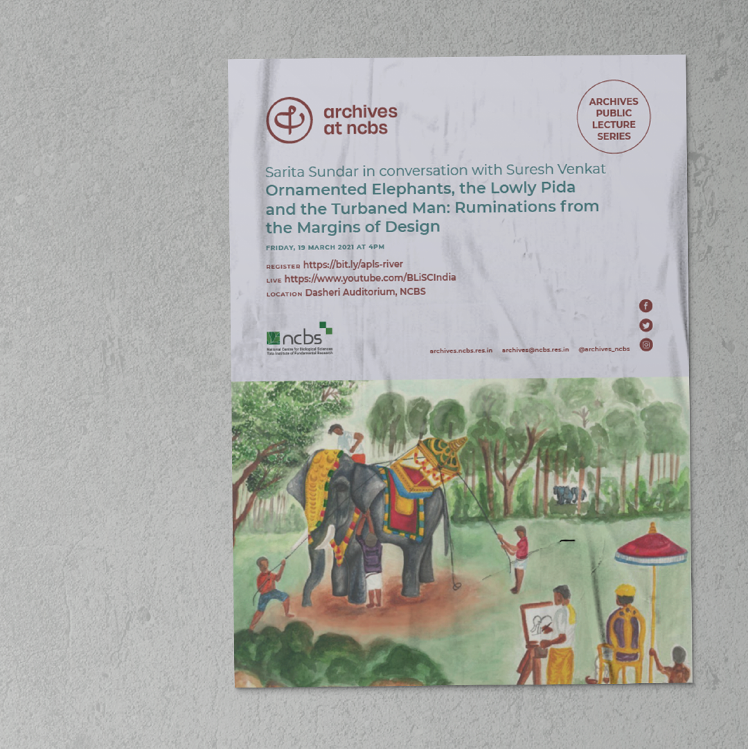
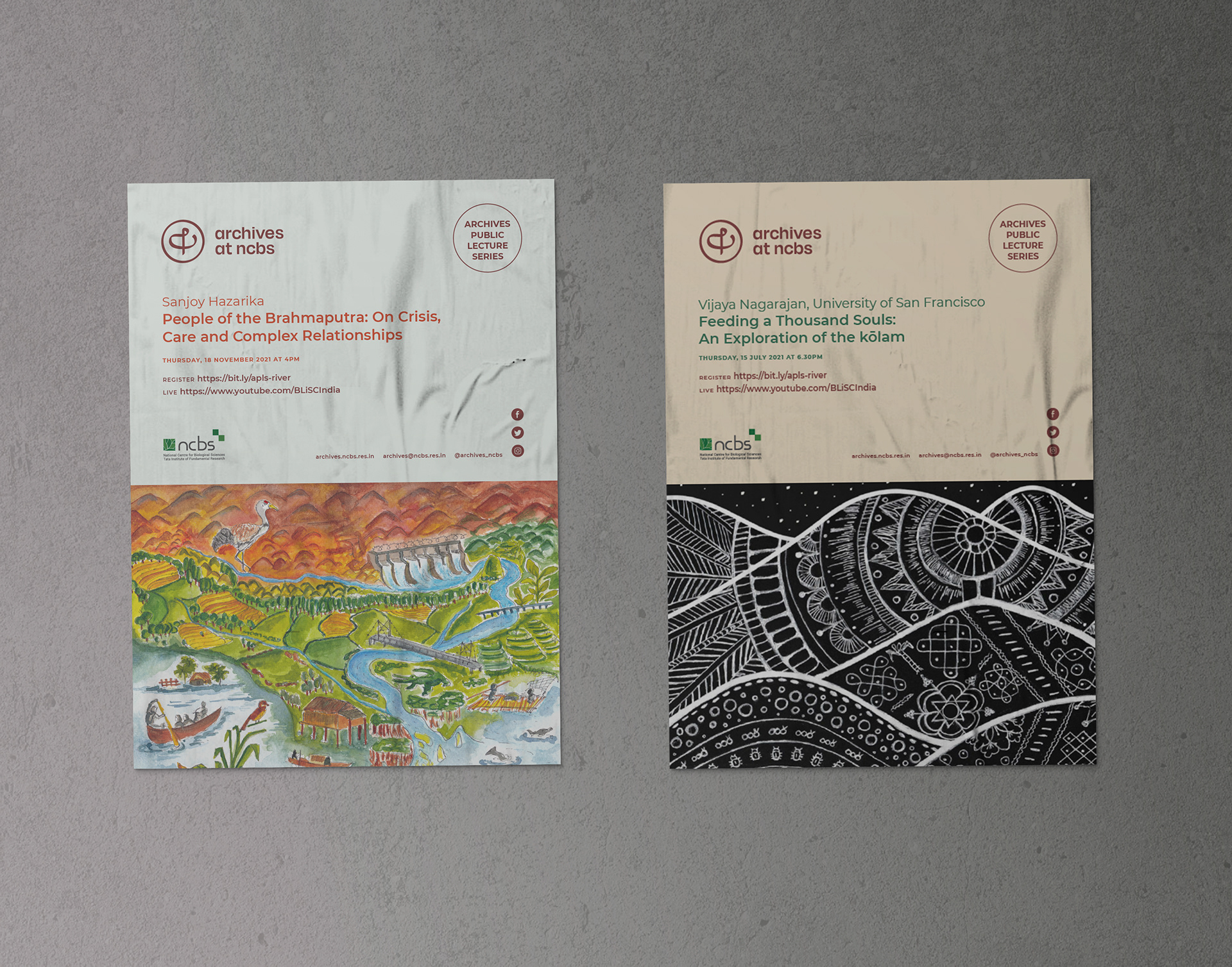
Diverse Stories
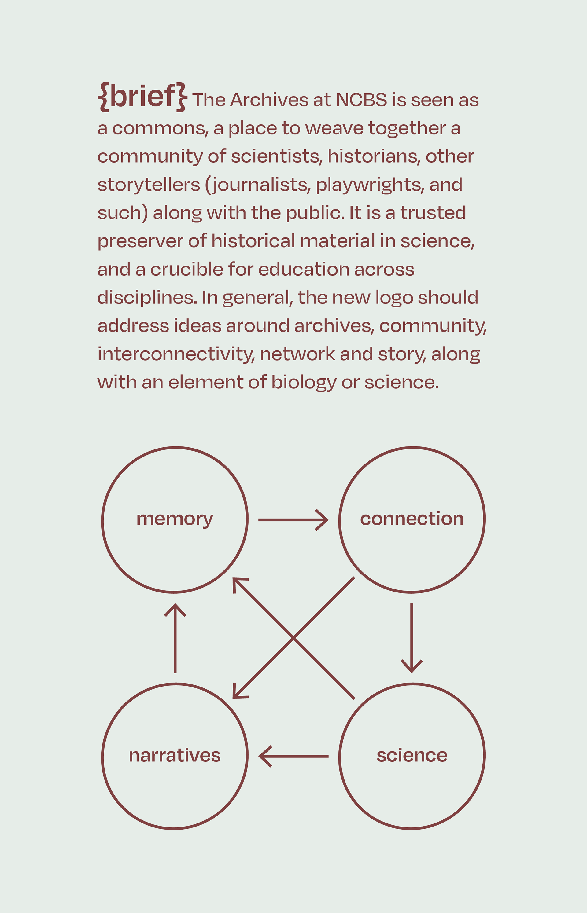
Using the keywords identified from the brief – memory, connection, narrative and science – we came up with the concept Diverse Stories.
In my interviews with the team at Archives, the following aspects stood out:
1. An archive is the preserver and enabler of diverse stories. It can take one thread of thought and weave it through many others, finding many connections, perspectives, and new ways of seeing.
2. Institutional archives are typically not very diverse in their collections. STEM suffers from a lack of diversity. The Archives at NCBS is different in that regard, it intends to facilitate diversity.
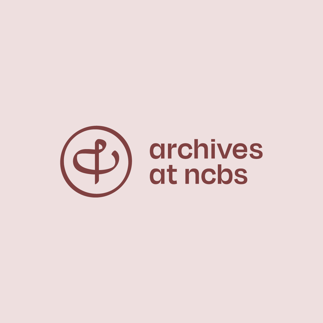
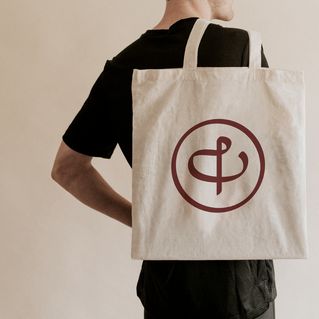
3. The team at Archives have been working on ideas around its identity even before I joined to assist. One such thought was around a symbol that can hold multiple meanings. They noticed that Ampersand and Treble Clef were constructed in the same manner, yet their forms had two diverse meanings depending on their context. This concept was more purposeful and made space for a distinct identity for the Archives at NCBS.
Process
A part of the process was to work on this idea of duality while simultaneously working on other concepts that may also find footing. However, over a course of a few months of trying different concepts, we kept coming back to the Ampersand. The Ampersand added a layer beyond the duality. It could encompass multiple stories, meanings and communities, an idea that was at the very core of the Archives at NCBS.
The idea of combining the 'a' of the archives with ampersand (&), began here.

Sample Applications
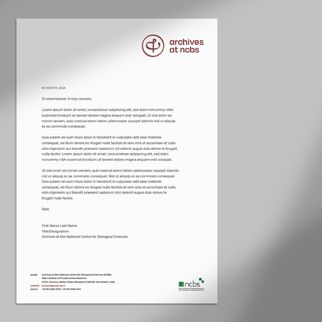
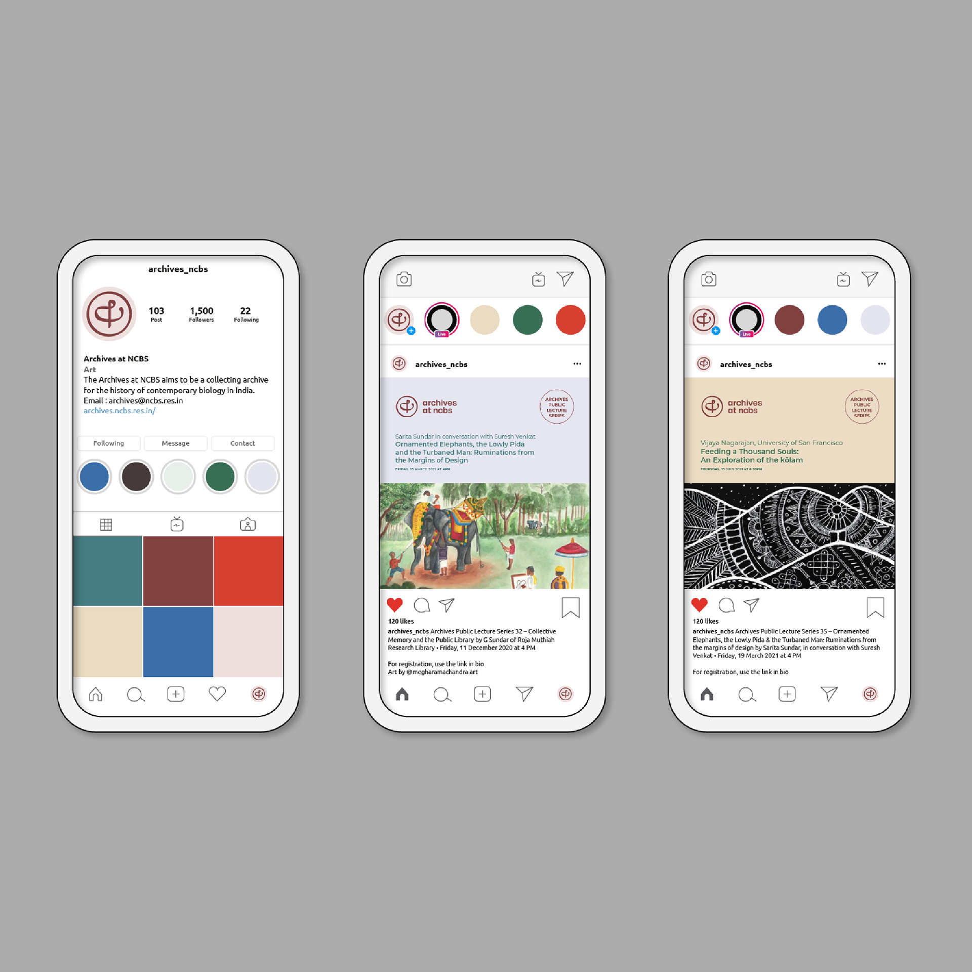
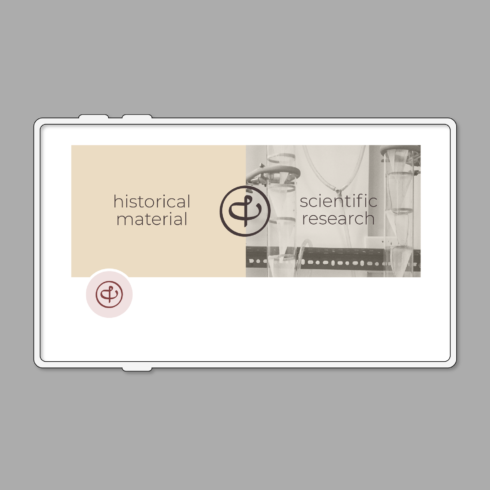
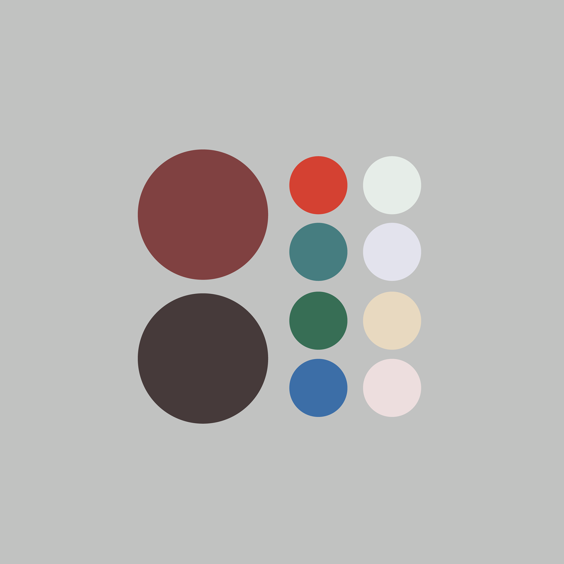
The main motive of this design exercise was to come up with a logo identity, a robust colour palette and define the brand typography. Most of the sample brand applications, that were created at this point was made to illustrate how this identity could potentially extend across various touch points.
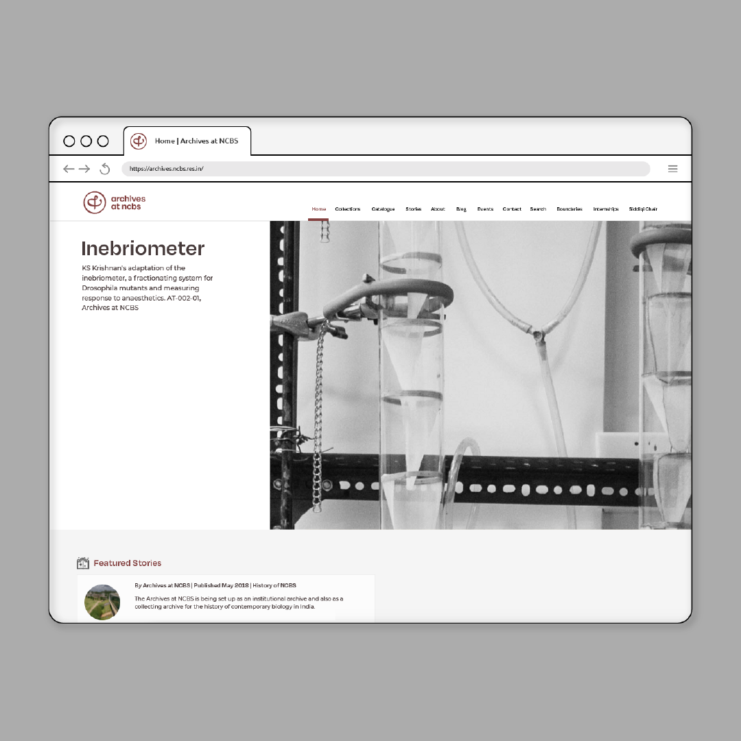
However, a longer exercise was undertaken a few months later to create a design system that would become the basis for the website design and communication design pieces that were developed for this new identity.
These were the different forms explored for the combined version of 'a + &'